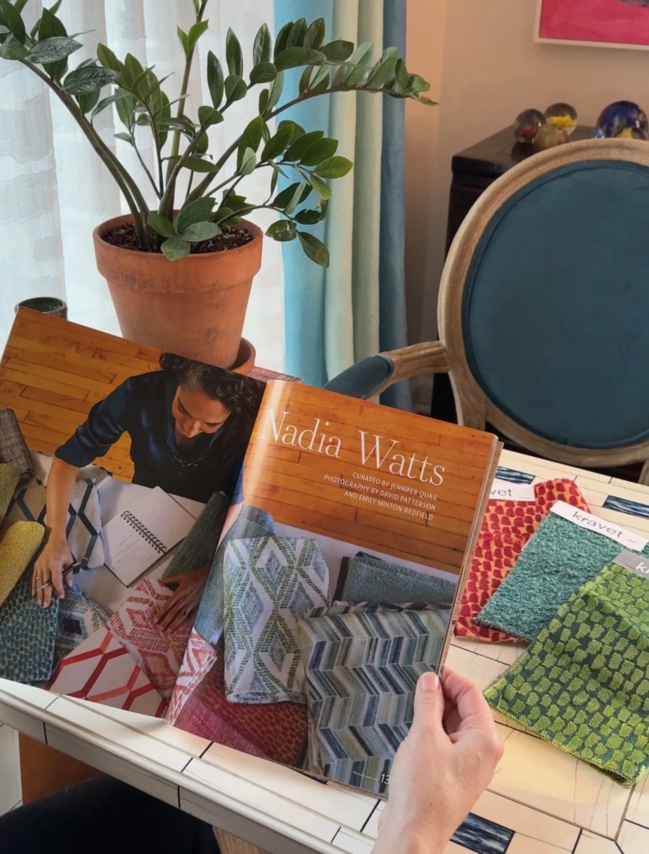
WATTS DESIGN

Luxe Interiors + Design - How Top Designers Get Color Just Right For The Home
Thank you Ileana Llorens and Luxe Interior +Design for asking my expert advice!
The Secret Sauce To Timeless Design…But how do you nail that timeless look everyone loves—the one straight out of a Nancy Meyers movie? For color lover and Denver-based designer Nadia Watts, it’s all about “the in-between hues—those that straddle two tones rather than leaning into a single, pure color.” She expands: “Think of a blue softened with green, a red enriched with blue, a grey infused with a cool undertone, or a white warmed with a hint of pink. These nuanced shades have greater longevity in a home because they shift gracefully with the light and surrounding materials, offering flexibility and depth.”

Parade Home & Garden - 18 Living Room Color Ideas That are Oh-So Inviting
The living room is the heart of the home. It’s where people gather, unwind, and make memories—so color here should feel thoughtful, welcoming, and reflective of your personality.
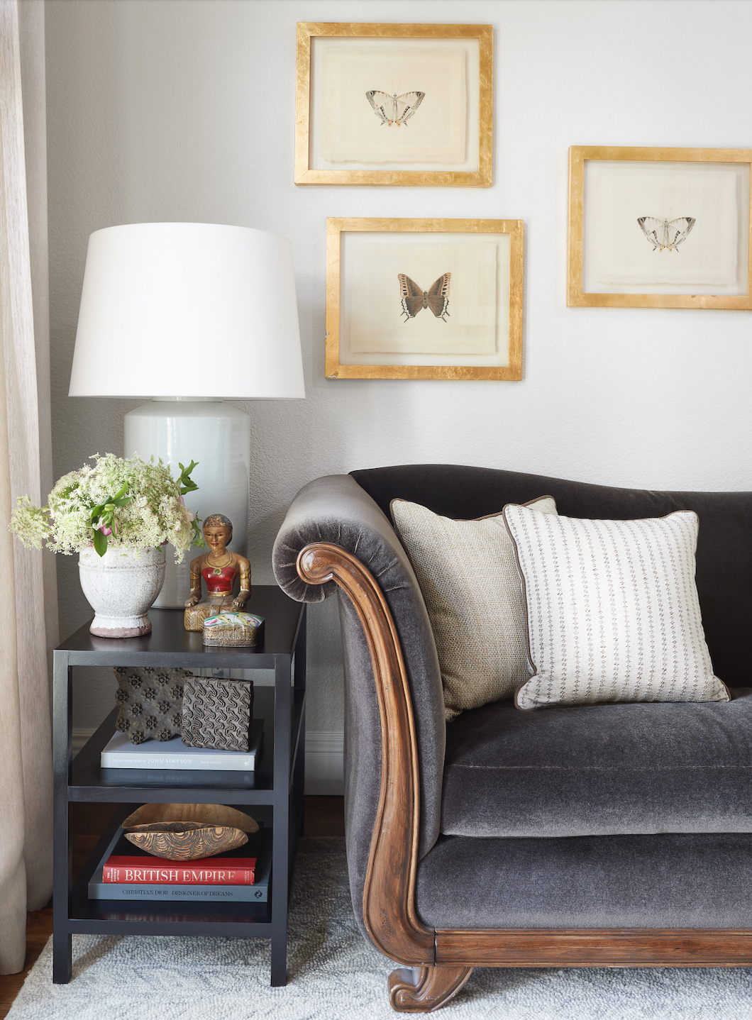
Anyone who is looking to experiment with color will find a lot of comfort in a more muted hue. When Denver-based designer Nadia Watts was looking to create a living room that felt “both comfortable and classic,” she selected Book Room Red by Farrow & Ball. “It instantly added a sense of warmth and sophistication,” she explains. “To balance the richness of the color, I incorporated subtly patterned upholstery and neutral-toned fabrics, bringing depth and softness while keeping the overall look grounded and timeless.”

TALD - Virtual Consultation with Nadia Watts
We are very excited and honored to share this news with you! I am now offering virtual design consultations through TALD @tald.co —a curated platform connecting clients with leading architects, interior designers, and landscape designers. It’s an honor to be part of this talented community, and I look forward to providing personalized guidance—no matter where you are located.
To schedule your virtual consultation— click HERE


Latest & Greatest